Note: This post is adapted from my internship presentation in the summer of 2019 for the Legal Services Corporation. At LSC, every intern gives a presentation for the whole office of what they accomplished that summer. I wanted to make my presentation interactive, so I decided to present a tutorial of an awesome skill I had learned that summer, webscraping!
Who am I?
Hello! I am Joanna and I hope to show you how to solve a problem like a data scientist. For me, it is important to contextualize information with the background of the informant. Knowing the presenter’s story helps me to connect to topics more deeply. Hopefully it will help you too!
In the summer of 2019 I was an intern for the Legal Services Corporation in their Office of Data Governance and Analysis. LSC is the nation’s largest funder of civil legal aid to legal aid organizations. Interning at LSC was an amazing opprotunity to grow my data science skills. When I began my internship, I had only been coding for half a year and I wasn’t sure if I would be able to keep up with “real data people.”
Luckily, though, because I had a supportive environment at ODGA I was able to grow so much as a data scientist and gain skills I thought were completely out of my reach. One of these skills was webscraping, which I will one of the methods for today’s tutorial.
I begin with this background because I truly believe that data science skills are within reach for everyone. Hopefully, during the time I have your attention, you will also see that thinking like a data scientist is something you can incorporate into your life.
What is this?
Like I said earlier, this is a tutorial on how to solve a problem like a data scientist. My main goal is to solve a problem together while having fun! In today’s approach, we will be using code. If you are someone who doesn’t have experience with code, my advice is this: don’t get lost in the sauce. Hopefully I can keep things at a high level to reach everyone.
We have a problem
https://www.lsc.gov/what-legal-aid/client-success-stories
LSC collects client success stories to show the individual impact of civil legal aid. How can we analyze and visualize patterns in the client success stories of LSC?
Plan of action
Thinking through our box of data science tools, what steps and methods do we need to take and use to solve our problem?
- Get the stories from the website into a text format we can work with (Webscraping)
- Clean the messy text and analyze it (Natural Language Processing)
- Visualize it (Wordcloud-ing)
Depending on our toolbox, we could come up with MANY plans (tons of which may not require code!). Thats’s to say, there’s single correct way to approach and solve a problem.
Step 1: Webscraping
# Navigate to Client Stories Page and extract all the links
page <- read_html("https://www.lsc.gov/what-legal-aid/client-success-stories") %>% html_nodes("a") %>% html_attr('href')

# Take only the links for client stories (not any on the header or footer)
urls <- page[68:185] %>% unique()
urls <- paste0("https://lsc.gov", urls)

# Write a function to scrape only the text of the client story from each link
scrape <- function(x) {
  story <- read_html(x)
  stories <- html_nodes(story, "div.field.field-name-body.field-type-text-with-summary.field-label-hidden.view-mode-full") %>% html_text()
}

# Apply the function to all links
stories <- lapply (urls, scrape)
Step 2: Natural Language Processing
# Remove punctuation, numbers, and uppercase letters from stories
corpus <- Corpus(VectorSource(stories)) %>% tm_map(removePunctuation) %>% tm_map(removeNumbers) %>% tm_map(tolower)

# Remove stopwords and strip whitespace
corpus <- tm_map(corpus, removeWords, stopwords("english"))
corpus <- tm_map(corpus, stripWhitespace)

# Calculate the frequency of each word in the client stories
dtm <- DocumentTermMatrix(corpus)
Step 3.1: Visualization
# Create a wordcloud of the words by frequency
wordcloud(names(frequency), frequency, max.words = 50)
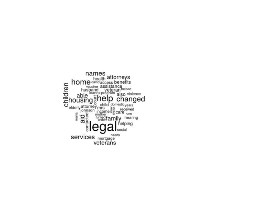
This visual is great and it does achieve goal of visualizing the patterns in the client success stories. But, the awesome thing about coding is its flexibility. With just a few more lines, we can clean up our visual and communicate more clearly.
Step 3.2: Cleaning it up
# Create a prettier wordcloud
layout(matrix(c(1, 2), nrow=2), heights=c(1, 4))
par(mar=rep(0, 4))
plot.new()
text(x=0.5, y=0.5, "Client Stories Frequency Wordcloud")
wordcloud(names(frequency), frequency,
          min.freq = 1,
          max.words = 250,
          random.order = FALSE,
          rot.per = 0.30,
          main = "Title",
          colors = brewer.pal(8, "Dark2"))
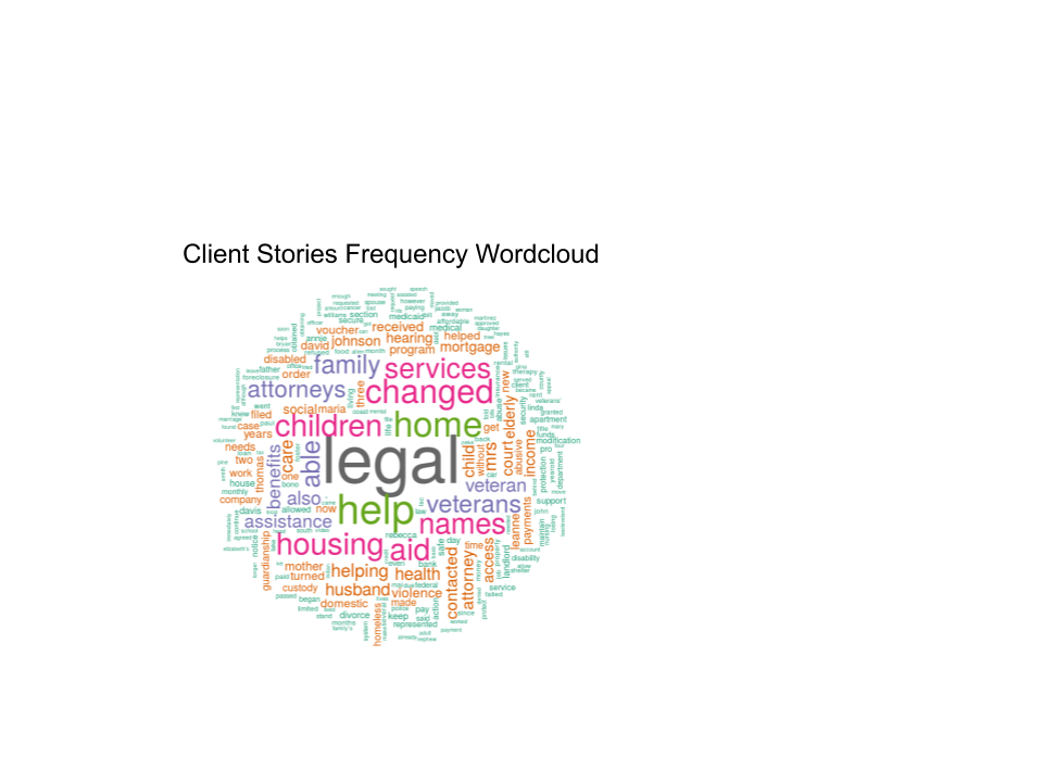
Awesome! Obviously, there are still a few ways we could improve this visual. We could use our NLP skills to take out names of people or combine words with the same stem. Taking it a step further, we could even add interactive elements to this visual, like the ability to filter by a client story topic or hover over a word to see the frequency count. The possibilities are endless!
Key takeaways
- I solved a problem like a data scientist! (And maybe it wasn’t so hard!)
- Maybe I’ll try it again sometime