Note: This is an update to a project I worked on in February 2019 for my Digital Journalism class portfolio. The original article can be found here. This post will focus on updating the graphics for that piece. The original article contains more context for the “No School Moves” movement, school redistricting, and integration and I would encourage anyone interested in those topics to check it out!
Time for a viz facelift!
Today I am revisiting a set of graphics I created a few months ago. I had a lot of fun with this project, but I do remember feeling rushed to churn out an analysis by my deadline. So, I was super excited to revisit this project and see what I could do with it now!
Background and Data
Before we get into the graphics themselves, let’s go over the project background and data source. My assignment was to write any story about user-generated content. I am a regular follower of the local news in my hometown of Arlington, Virginia and I had been reading about controversial a plan to redistrict elementary school boundaries when I got this assignment. I thought my hometown drama was an excellent topic because I was truly interested to see what insights could be gained by looking at the rhetoric of commenters. Going further, I wanted to situate this movement in a national conversation about NIMBYism and integration of schools.
The data, then, for this project, came from comments on a January 28 Arlington Now article, “Petition Against School Swap Garners 1,700+ Signatures” and a January 19th Nextdoor post on the No School Moves petition. After checking through the data use agreements of both these sights, I determined that they were appropriate to webscrape. For privacy purposes, however, the data are deidentifed and the analysis focuses on looking at trends in aggregate.
I had two overall goals for my original project. My first goal was to analyze, overall, how commenters were talking about this issue. My second goal was to suss out any differences between conversations on the two platforms. On Arlington Now, commenters can hide behind anonymous usernames (Arlington Now comment threads are also known to be particularly ruthless). On Nextdoor, user’s names and addresses are available to neighbors.
Original Visuals
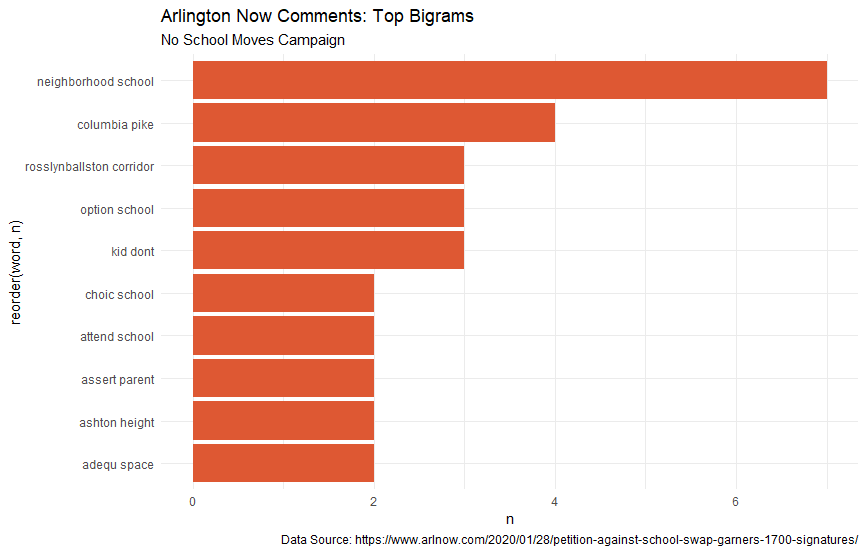
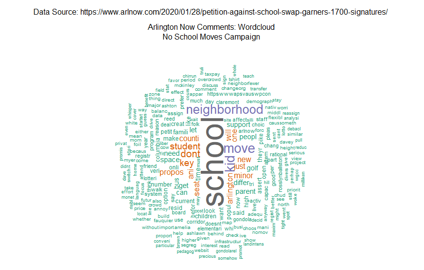
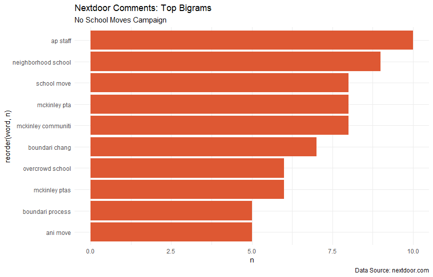
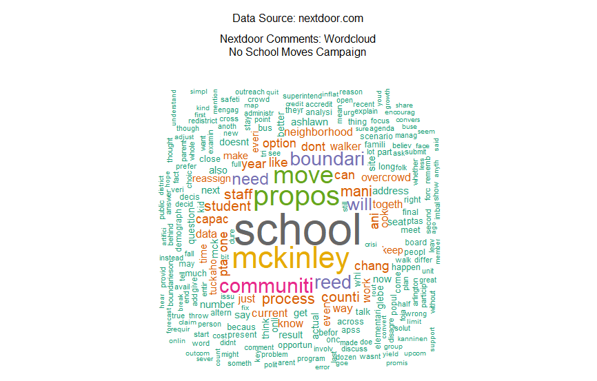
Here are my original graphics for this project. Let’s talk about their strengths:
- They mention the data source, which is something I often overlook in a low-stakes project
- The color palette for the wordclouds is nice
And that’s about it. These graphics get the job done, but they definitely don’t turn any heads (unless your favorite color is orange). I think for now, I’m going to focus on revamping the bar charts for this project. For the updated graphics, I hope to implement these changes.
- Clean up their look overall (rename axes, anything other than orange bars)
- Come up with a single viz that compares the two data sources
- Try to add inferential analysis to the viz
Let’s get to work!
The Facelift
My first step was to decide what language or software I wanted to work in. The previous graphs were made in R, so it would be easy for me to continue working there with my clean data. I did tinker for a few hours with the data in an Observable notebook to make the new graphics using d3. Ultimately, though, decided to hang up my JavaScript-learning hat for the day and stick with R.
Once I fired up my old project, the first thing I did was combine my two clean dataframes into one document term matrix. In my original graphs, I was trying to compare the top bigrams (word pairs) in the two sources. To have a clearer comparison, though, I’ll have to stick to single word frequency. Here’s what the first six rows look like.
head(dtm)
# A tibble: 6 x 4
  document term       count document_name
  <chr>    <chr>      <dbl> <chr>
1 1        abingdon       1 Arlington Now
2 1        absolut        1 Arlington Now
3 1        accomplish     1 Arlington Now
4 1        accord         1 Arlington Now
5 1        acknowledg     1 Arlington Now
6 1        acquir         1 Arlington Now
A document term matrix is a great way to organize text data, especially if you’re analyzing word frequencies. Because I wanted to visualize a comparison between my two documents, this data structure was a no brainer for me.
The next thing I did was prepare the data for graphing by altering the scales. On our previous bar graphs the scales were different, which doesn’t make for great comparison. Even if I graphed my new combined document term matrix using the count variable, I still wouldn’t get a totally fair comparison since there was more data overall from Nextdoor. To fix this, I created a new variable for the percent term frequency. Whenever you’re comparing data from two sources, it is generally a better idea to scale according to percentages rather than raw count to achieve a fair comparison.
Before I could move on to graphing, I still had one more variable I wanted to create. As I mentioned earlier, one of my goals for the new visuals was to incorporate some kind of inferential analysis into the visual. One thing that struck me when I first completed this analysis was the frequency of terms referring to schools on both platforms. For my new graphs I decided to create a variable to differentiate school terms from the rest.
Finally, it was time to begin graphing! To make the graph less busy, I filtered out terms that were mentioned less than 10 times. Like the previous graphs, I ordered the bars so that the greatest frequency terms were first. Because my data was now in a single document term matrix, comparing the two sources was as easy as setting a ggplot parameter to color the bars according to document name. My next step was so set a parameter for the school variable, which would be shown as a black outline on the colored bars. Lastly, I added back my excellent labels and captions, even adding a note to help make reading the graph a little easier.
Here’s the final code and viz!
dtm %>%
  group_by(document_name) %>% mutate(perc = count/sum(count)) %>% ungroup() %>%
  mutate(school = ifelse(term %in% schools, "yes", "no")) %>%
  filter(count > 10) %>%
  ggplot(aes(x = reorder(term, count),
             y = perc*100,
             fill = document_name,
             color = school)) +
  geom_col() +
  coord_flip() +
  scale_color_manual(name = "Does the term refer to a school?", values = c("white", "black")) +
  scale_fill_discrete(name = "Comment source") +
  labs(title = "How are commenters talking about the No School Moves movement in Arlington?",
       subtitle = "A comparitive analysis of local user generated content",
       caption = "Only terms with an overall frequency greater than are 10 shown
       Data sources: https://www.arlnow.com/2020/01/28/petition-against-school-swap-garners-1700-signatures/;https://www.nextdoor.com") +
  xlab("Terms") +
  ylab("Percent term frequency (e.g. 'mckinley' accounts for 2% of all terms in Nextdoor comments)") +
  theme_classic()
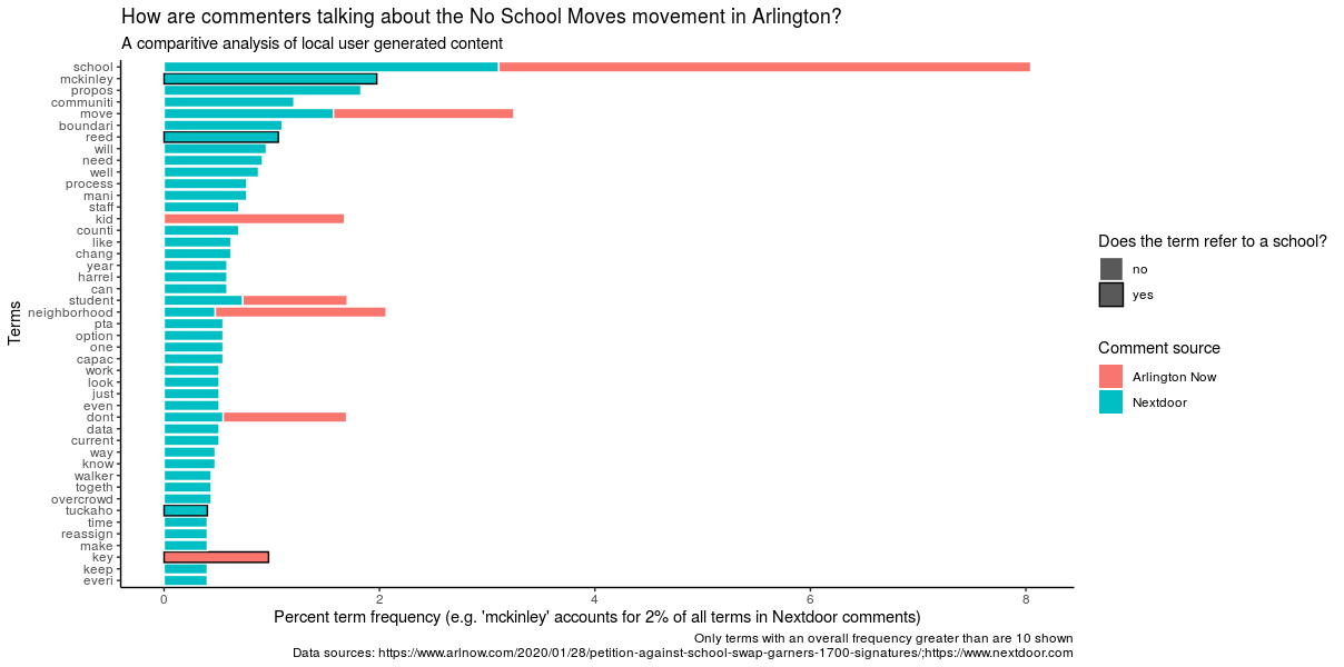
Awesome! I really like the updates I made to this project, especially taking the step to incorporate some inferential analysis into the viz. Of course, there’s always more to be done with a project. In the future I could see myself heading back into Observable to try to add some interactive features to the viz. Or, I could even try a new method of analysis, like text networks or sentiment analysis.
Thanks for sticking with me and I hope you learned something!