DISCLAIMER: I am not an epidemiologist. This visualization was created with the intent of being a tutorial for newbie coders using publicly available data. For accurate, up to date visualizations of COVID-19 I suggest visiting the CDC or Johns Hopkins. If you visualize COVID-19 data yourself I suggest you keep it private or share it with a disclaimer clearly stating your intentions.
library(ggplot2)
library(gganimate)
library(dplyr)
library(tidyverse)
data <- time_series_19_covid_combined
data <- data %>% rename("Country" = "Country/Region", "Province" = "Province/State") %>% filter(Country != "China")
### For this project we are using datasets/covid-19 for an up to date, real world example!
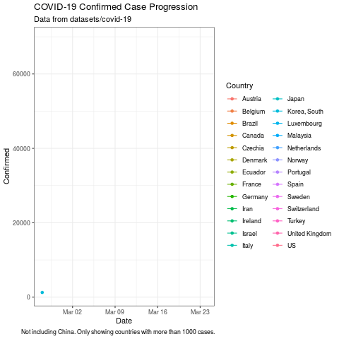
plot <- ggplot(subset(data, Confirmed > 1000),
aes(x = Date, y = Confirmed, color = Country)) +
geom_line() +
theme_bw() +
labs(title = "COVID-19 Confirmed Case Progression", subtitle ="Data from datasets/covid-19", caption = "Not including China. Only showing countries with more than 1000 cases.")
plot
plot +
geom_point() +
transition_reveal(Date)